Cycling through all six. Tap any point to stop.
Measured on six things
Daily guided practices for focus, reflection and better habits.
Usability
58Clear in-app navigation with labelled tabs and progress rings, but the landing page buries the next step under three CTAs and microcopy that can't decide if you're joining a waitlist or an app.
Screenshots
1 / 1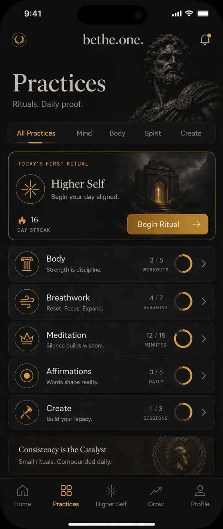
About this app
BeTheOne helps you build a daily practice around focus, reflection, and healthier habits. In the web app, you can choose a guided exercise, write a journal reflection, or use a timer for a focused work session. Higher Self AI helps you think through a question and choose a next step. The public Mac beta adds a menu-bar focus timer on Apple Silicon.
Key features
- 1Six-practice daily model: reflection, body, breathwork, meditation, affirmations and creative work in one routine.
- 290-day evidence arc (Day 01 choose, Day 30 return, Day 90 know) with progress tracking instead of streak pressure.
- 3Higher Self AI prompt to think through a question and choose a next step, plus a Mac menu-bar focus timer in beta.
Target customer profile
Drawn from the product itself, not from a survey.
Demographic
Founders and team leaders juggling packed calendars
Pain points
Days consumed by meetings and messages, no room for priorities
Primary needs
A quick way to choose one meaningful priority before the noise
Demographic
Fathers wanting more presence at home
Pain points
Distracted, reactive, missing small family moments
Primary needs
Small, realistic presence practices that fit family life
Demographic
Professionals facing burnout or exhaustion
Pain points
Every new routine feels like too much; motivation gone
Primary needs
A gentler start with a pause, smaller demands, and support
Scout Review
Written by AI from measured evidence, scored out of 100.
BeTheOne is a daily-practice app built around reflection, movement, breathwork, meditation, affirmations and creative work, with a 90-day evidence arc and a Higher Self AI prompt. The technical foundation is genuinely strong — 100/100 Lighthouse performance, a full security-header sweep, and a homepage that looks like a premium editorial product. The weaknesses are coherence and clarity: the app and the site use different visual systems, the trust row cites an unrelated dating app, the hero has three competing CTAs, and the accessibility failures are exactly the ones users notice. The idea itself is differentiated — six practices plus a 90-day proof loop is more than another meditation timer — but the positioning tries to serve founders, fathers and burnout professionals simultaneously, which dilutes the wedge.
Measure by measure
Usability
58Clear in-app navigation with labelled tabs and progress rings, but the landing page buries the next step under three CTAs and microcopy that can't decide if you're joining a waitlist or an app.
Design
70Confident editorial homepage — full-bleed photography, disciplined type, cream/dark rhythm. Undercut by a blank panel, a dating-app credential, and an app UI that uses a different visual system.
Speed
88Lighthouse 100/100 on both mobile and desktop: LCP 1.2s, CLS 0.006, TBT 0ms. Genuinely fast, no lag complaints in evidence.
Security
74Full security-header sweep: HTTPS enforced, HSTS, CSP, frame protection, Referrer-Policy, Permissions-Policy, SPF and DMARC — 12/12 checklist points. No published audit or bug bounty found.
Accessibility
78Lighthouse 96/100 with two real failures: insufficient color contrast and visible-text labels without matching accessible names. Micro-labels and the language switcher are visibly small and low-contrast.
Growth
62Real problem, three named segments, and a six-practice + 90-day evidence model that's more differentiated than another meditation timer. Wedge is clear; ceiling is the crowded wellness shelf.
Improvement areas
- Brand coherence: homepage (cream editorial) and app (black-and-gold) use different visual systems.
- Hero clarity: three competing CTAs and microcopy that doesn't explain what joining yields.
- Accessibility: two Lighthouse failures — insufficient contrast and visible-text labels without accessible names.
Design & Usability
The homepage is genuinely well-crafted: full-bleed photography, tightly tracked grotesque headlines, monospace micro-labels and alternating cream/dark sections that give it an editorial rhythm most wellness apps never reach. The problem is coherence. The app screen uses a black-and-gold stoic system that shares nothing with the cream homepage, so the brand reads as two products stapled together. The trust row cites a dating app and a 5M-member credential that has nothing to do with habit-building. Usability is similarly split: in-app navigation is clean — labelled tabs, gold active state, progress rings with unit labels — but the landing page offers three competing CTAs and microcopy ('Email updates first. Separate app signup next.') that leaves a visitor unsure whether they're joining a waitlist, a newsletter, or an app.
Speed & Security
Speed is the standout: Lighthouse 100/100 on both mobile and desktop, LCP 1.2s, CLS 0.006, TBT 0ms. Whatever stack this is built on, it's lean and it's fast, and there are no lag complaints in the collected evidence. Security is solid on the technical side — HTTPS enforced, HSTS, CSP, frame protection, X-Content-Type-Options, Referrer-Policy, Permissions-Policy, plus SPF and DMARC for a clean 12/12 on the header probe. What's missing is the paperwork: no SOC 2, ISO, pen-test summary or bug-bounty program surfaced in the site content. For an indie wellness app handling journal entries and personal reflections, that's not unusual at this stage, but it's the gap between 'well-configured' and 'audited'.
Accessibility & Growth
Accessibility lands at 96/100 on Lighthouse, but the two failing audits are the ones users actually feel: insufficient color contrast and visible-text labels without matching accessible names. The visual audit backs this up — micro-labels, card preview text and the FR/DE/SQ language switcher are all very small and low-contrast, which reads as decoration rather than information. There's no WCAG statement on the site. Growth is the more interesting question. The problem is real and the segments are specific — leaders and founders, fathers, burnout professionals — each with a tailored starting point. The six-practice model (reflect, body, breathwork, meditation, affirmations, create) plus a 90-day evidence arc is a genuine differentiator against Headspace, Calm and Stoic, which each own a single modality. The wedge is clear; the ceiling is the crowded wellness shelf and the fact that the product is trying to serve three audiences at once.
Conclusion
If you're a founder or a professional who wants a single place to hold reflection, movement and breathwork together rather than juggling three apps, BeTheOne is worth a look — the 90-day evidence framing is a smarter hook than another streak counter. Go in knowing the landing page is a bit of a maze and the app looks nothing like the site. The team clearly knows how to build fast, secure software; the next job is deciding who this is for and making the brand say it in one voice.
Suggestions for improvement
- Unify the homepage and app visual systems — cream editorial and black-and-gold stoic currently read as two products.
- Replace the 'dua.com #1 Albanian dating app' trust credential with something relevant to habit-building or reflection.
- Collapse the three hero CTAs into one and state plainly what 'Join the community' gets the user.
- Fix the two Lighthouse a11y failures: raise contrast on micro-labels and give visible-text buttons matching accessible names.
Alternatives comparison
Named competitors, point by point. Nobody paid to appear here or to be left out.
 BeTheOne |  Headspace |  Calm | Stoic | |
|---|---|---|---|---|
| Core modality | Six practices: reflection, body, breathwork, meditation, affirmations, creative work | Guided meditation and mindfulness sessions plus sleep content | Meditation, sleep stories and relaxation | Journaling and reflection built around Stoic philosophy |
| Progress framing | 90-day evidence arc (Day 01 / 30 / 90) with per-practice progress rings | Streaks, session counts and course completion | Streaks and daily calm tracking | Journal entries and mood tracking over time |
| AI assistance | Higher Self AI helps think through a question and pick a next step | Ebb AI companion for meditation guidance | Limited AI features; primarily curated content | Prompt-based journaling; no prominent AI companion |
| Platform coverage | Web app, iPhone TestFlight beta, Mac menu-bar beta (Apple Silicon) | iOS, Android, web | iOS, Android, web, desktop | iOS, Android, web |
| Target audience | Founders, fathers, burnout professionals seeking presence and follow-through | Broad consumer mindfulness and sleep audience | Broad consumer relaxation and sleep audience | Reflective users drawn to Stoic philosophy and journaling |
Headspace
Popular meditation and mindfulness app with guided sessions and sleep content; BE THE ONE blends meditation with reflection, movement, breathwork and creativity in one daily practice.
Calm
Wellness app focused on meditation, sleep stories and relaxation; BE THE ONE leans more on daily intentional action and building evidence of follow-through over 90 days.
Stoic
Journaling and reflection app built around Stoic philosophy; BE THE ONE pairs reflection with body, breathwork, affirmations and creative practices plus progress tracking.
Comparing options? See BeTheOne alternatives, scored side by side
More Health & Wellness apps
View all Health & Wellness
StoryPad
92Privacy-first open source journal app with a continuous t...

Pushup RPG: Fitness Quest
90Pushup RPG is a camera-based push-up counter and fitness RPG for home workouts. Real push-ups and squats become attacks as you defeat 48 foes across 8 biomes, earn XP and loot, join guilds, and battle in live 40-second duels. Free on iOS and Android.

Gryper
89Workout tracker with muscle heatmaps and volume landmarks

Snapkin: Photo Calorie Counter
88Snapkin is a calorie tracker you use by photographing your plate.

Innermost
87An AI-powered emotional support app that acts as a person...

Cat Years to Human Years
86Free cat age calculator converting cat years to human years.

Mantra Meditation Timer
85A minimalist, distraction-free meditation timer for mantr...

TDEE Calculator
84Free TDEE calculator that estimates maintenance calories, weight loss targets, muscle gain calories, and macro recommendations based on your body stats and activity level.

FitLifeBud
84AI meal plans for your week, with one aisle-sorted shopping list

WellWired
84AI explained simply for older adults, with safety lessons...

TheBean.ai
84Adaptive AI personal trainer that evolves with your progr...

SayLift
84Voice workout log and calorie counter for iPhone


A platform dedicated to providing unbiased reviews of newly launched applications, analyzing everything from their features to their full potential.
info@scoutforge.net© 2026 Scoutforge. All rights reserved.
