Cycling through all six. Tap any point to stop.
Measured on six things
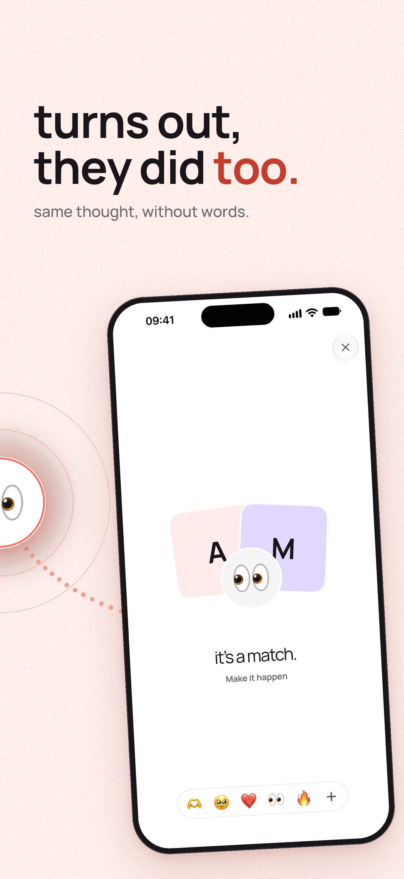
Same thought, without words.
Growth
58A real, specific problem — wanting to signal interest without risking rejection — with a clear anti-feed wedge and a defined audience. But the mechanic is easy to copy and depends on both people already having the app.
Screenshots
1 / 6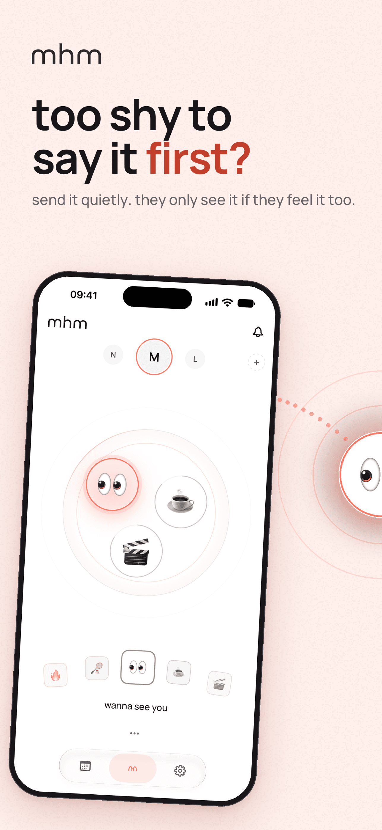
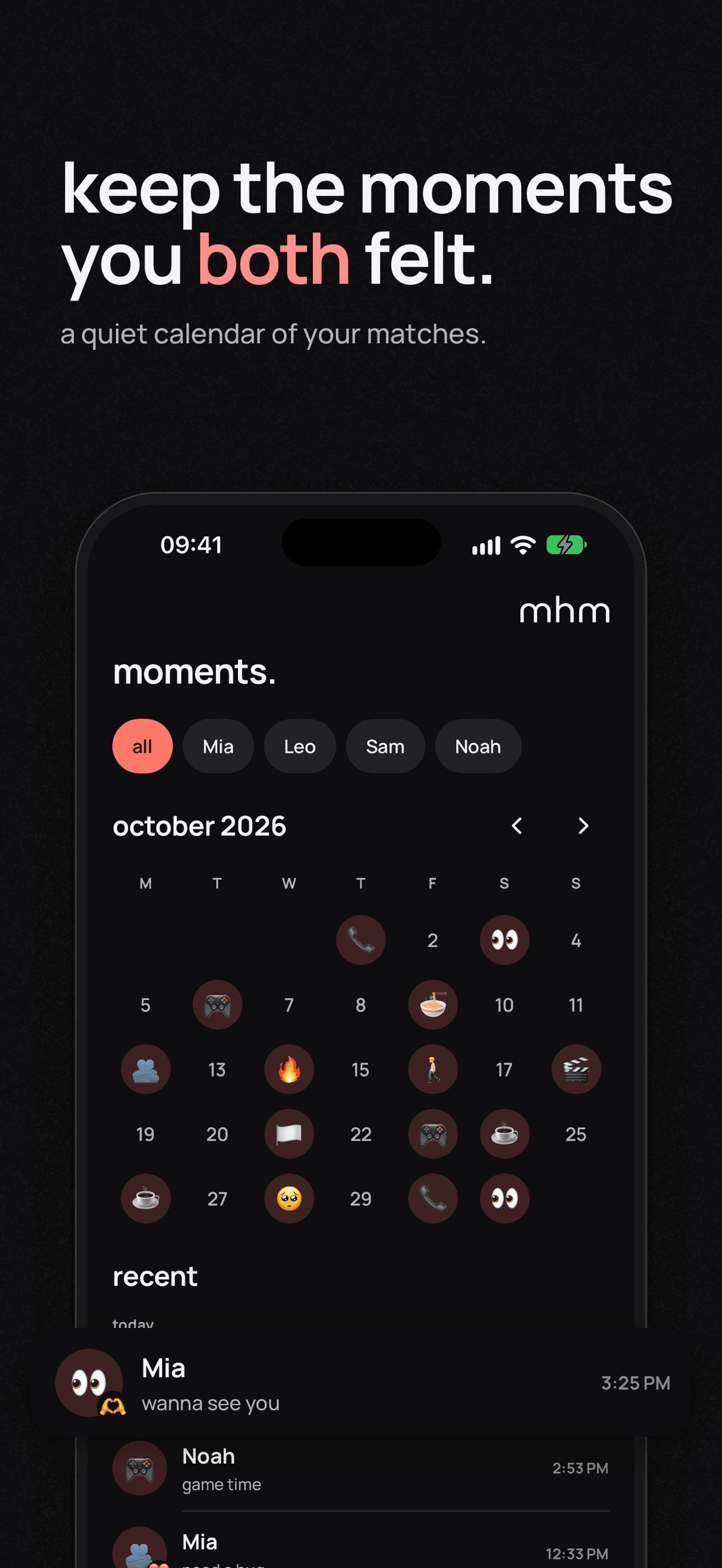
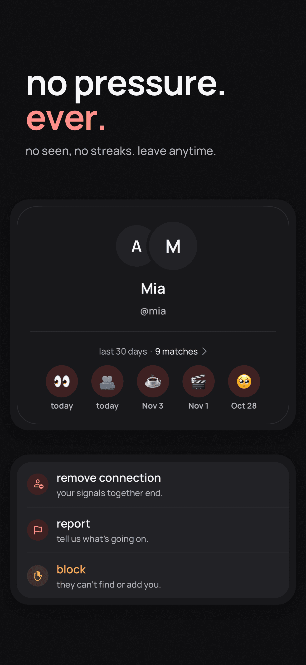
About this app
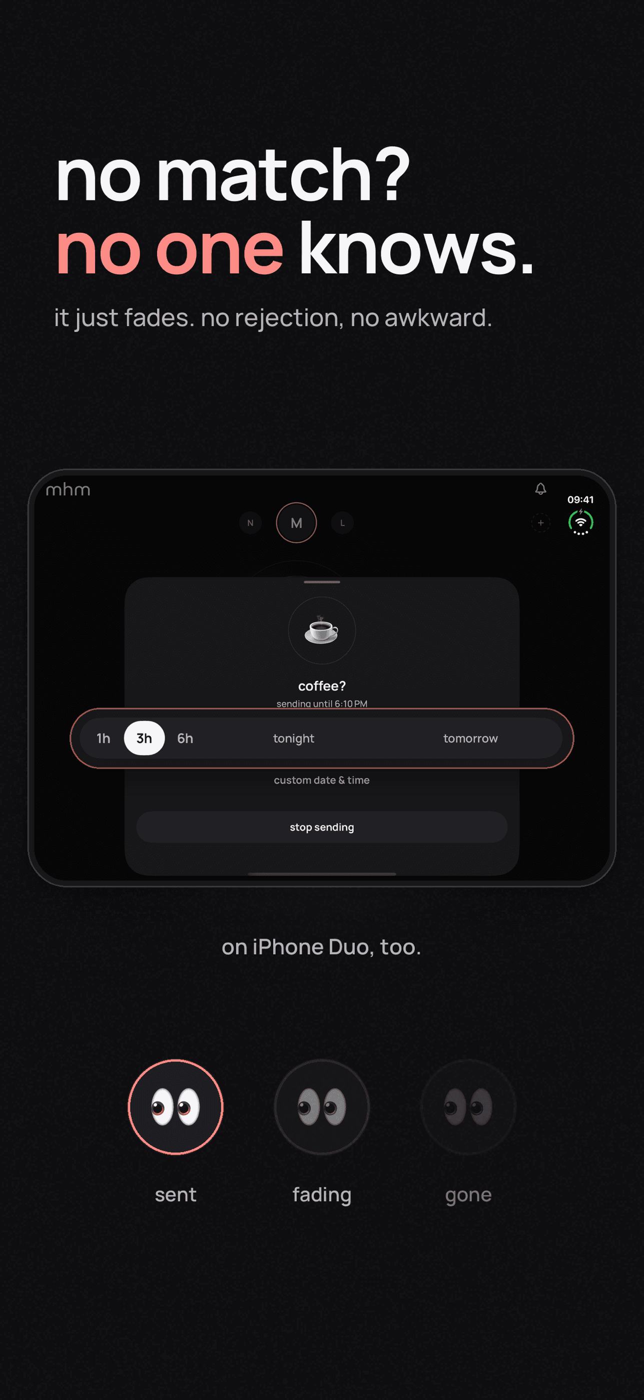
Same thought, without words. Pick someone you're connected with and set a private signal for them: coffee?, call me?, miss you, kinda like you. They never see it. Nothing is sent and no one is notified. If they set the same signal for you while yours is still on, you both get one quiet notification: a match. If not, your signal simply fades away. • Private by design: the other person learns nothing until it's mutual. • No chat, no feed, no streaks, no seen receipts, no red badges.
Key features
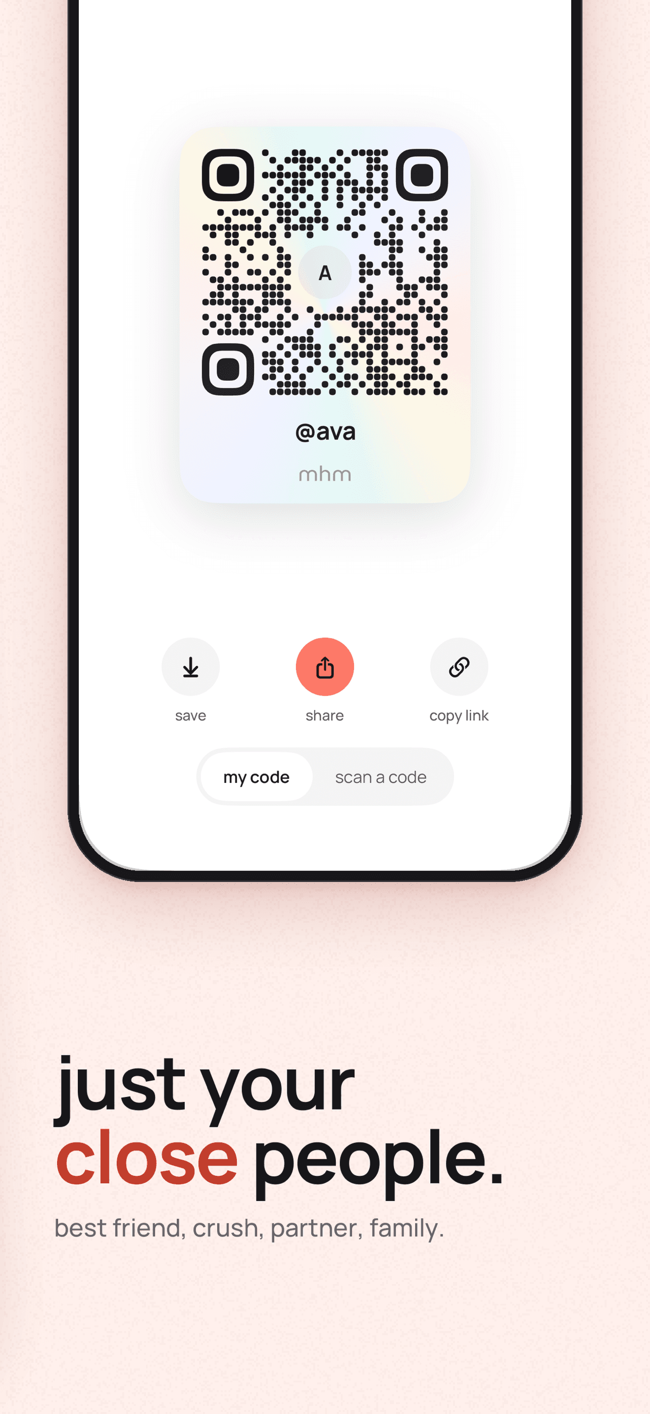
- 1Private mutual signals: pick an emoji signal for someone; they never see it until you both pick the same one.
- 212 signals, 3 at a time, with custom names and timers from 1 hour to tomorrow.
- 3No chat, feed, streaks, seen receipts or red badges — notifications only for matches and connection requests.
- 4Widgets, Live Activity, Control Center, Apple Watch and Focus filter support.
- 5mhm+ adds unlimited signals, emoji styles, custom durations and a partner pass.
Target customer profile
Drawn from the product itself, not from a survey.
Scout Review
Written by AI from measured evidence, scored out of 100.
mhm is a private mutual-signal app: pick an emoji signal for someone, they never see it, and if they pick the same one while yours is on, you both get one quiet notification. It is fast, visually coherent, and refreshingly honest about what it refuses to do — no chat, no feed, no streaks, no seen receipts. The concept is graspable in seconds and the FAQ answers the real questions. The weaknesses are security hygiene (no enforced HTTPS or HSTS on a privacy-first product), small-text accessibility, and a cold-start dependency that the product itself does not address.
Measure by measure
Usability
63The concept is graspable in seconds and the FAQ answers the real questions. But onboarding detail is thin, the demo is a static mock, and small labels plus tiny emoji controls make the app harder to read than it should be.
Design
71Judging the app UI and store material: a cohesive blush-and-black system with one red accent and a distinctive emoji-signal vocabulary. Homepage craft is strong, but tiny grey captions and low-contrast demo text weaken it.
Speed
88Lighthouse mobile 100/100 with LCP 949ms, CLS 0 and TBT 0ms; desktop also 100/100. The site is genuinely fast and light, with no lag complaints in the collected evidence.
Security
61HTTPS is not enforced and HSTS and Permissions-Policy are missing, though CSP, frame protection and DMARC are present (7/12). No SOC 2 or audit claims; privacy-by-design messaging is the main assurance.
Accessibility
79Lighthouse scores 100/100 with one failing audit on accessible names, and the app ships in 12 languages. Against that, the visual audit found 9–10px labels and low-contrast grey captions that automated checks miss.
Growth
58A real, specific problem — wanting to signal interest without risking rejection — with a clear anti-feed wedge and a defined audience. But the mechanic is easy to copy and depends on both people already having the app.
Improvement areas
- Security headers: enforce HTTPS, add HSTS and Permissions-Policy.
- Accessibility: raise tiny labels and low-contrast captions to readable sizes.
- Cold start: give non-users a way to understand and join without a manual explanation.
- Onboarding: add an in-app walkthrough or interactive demo beyond the static mock.
Design & Usability
Judged on the app UI and store material, mhm has a genuinely coherent identity: blush background, black type, one red accent, and an emoji vocabulary that carries from the homepage into the signal wheel. The hero phone mockup puts the product in the first viewport, which is right for an app whose interface is the pitch. Usability is decent — the concept lands in seconds and the FAQ pre-empts the obvious questions about privacy and matches. The drag is scale: 9–10px feature labels, tiny grey captions on the black demo section, and small emoji controls in the screenshots all ask more of the reader than they should.
Speed & Security
Speed is the standout: Lighthouse mobile 100/100 with a 949ms LCP, zero CLS and zero TBT, and desktop matching. There is nothing to complain about on load. Security is the weak flank. The probe found HTTPS not enforced, no HSTS, no Permissions-Policy, and only 7 of 12 checklist points, despite CSP, frame protection and DMARC being present. For a product whose entire value proposition is 'the other person learns nothing,' the transport layer should be the most locked-down part of the stack. No SOC 2, ISO or pen-test claims were found.
Accessibility & Growth
Accessibility looks strong on paper: Lighthouse 100/100, one failing audit on accessible names, and 12 languages shipped. The caveat is that automated checks only cover part of WCAG, and the visual audit found exactly the kind of thing axe misses — 9–10px labels and low-contrast grey captions. Growth is a judgement on the idea. The problem is real and specific: signalling interest without risking rejection, for people you already know, explicitly not dating. The anti-feed, no-streaks positioning is a genuine wedge. The limit is structural — the mechanic only works when both people have the app, and nothing in the product solves that cold-start problem.
Conclusion
If you have one specific person you keep almost-texting, mhm is a low-stakes way to find out whether they are doing the same. It is free to match, the paid tier is optional extras, and the partner pass is a nice touch. Just do not expect it to work on someone who has never heard of it — the whole design assumes both of you are already in.
Suggestions for improvement
- Enforce HTTPS and add HSTS and Permissions-Policy headers; a privacy-first app should not miss these.
- Raise the 9–10px feature labels and grey captions to meet contrast and size minimums.
- Add a shareable invite that explains the concept to a non-user, to soften the cold-start problem.
- Publish a short security/privacy page describing data handling and retention.
Alternatives comparison
Named competitors, point by point. Nobody paid to appear here or to be left out.
 mhm |  | |
|---|---|---|
| Private mutual signal mechanic | Yes — core feature | Not applicable |
| No chat / no feed / no streaks | Yes — explicit design choice | Not applicable |
| Apple Watch and widget support | Yes | Not applicable |
| Free tier | Yes — matching free, 15 signals per person | Not applicable |
| Paid tier | $3.99/mo, $29.99/yr, $49.99 once | Not applicable |
Comparing options? See mhm alternatives, scored side by side
More Social & Community apps
View all Social & Community
username.md
90One verified handle for your online identity, readable by...

HackathonHost
88End-to-end hackathon and game jam event management software

Creastor
88An all-in-one platform for creators to sell digital produ...

LaunchSpot
87A vibrant platform for discovering and launching new tech...

67ez
86Free viral 67 (Six Seven) browser games, world counter & ...

Camera Wedding
84Collect every guest photo with one QR code. No app needed. One QR code collects every wedding guest's photos into a private shared album. No app or login for guests. One-time price from $49.

Recap Raven
83Discord bot for D&D session recordings, AI recaps, and se...

Dev Hunt
82A launchpad for discovering and voting on the best new de...

TikSave
81Free Download TikTok videos without watermark in HD and conver...

PostPocket
81A powerful content management app for iPhone users to save, organize, and access articles and posts offline.

Samasemua
80Samasemua is a dynamic platform empowering creators to monetize digital products with an intuitive website builder and community support.

FlowPrompter
80A web-based teleprompter with a transparent interface for seamless script delivery during recordings, ideal for content creators and professionals.


A platform dedicated to providing unbiased reviews of newly launched applications, analyzing everything from their features to their full potential.
info@scoutforge.net© 2026 Scoutforge. All rights reserved.
