Cycling through all six. Tap any point to stop.
Measured on six things
Your AI friend with truly excellent local taste
Usability
54Nav is clear and the chat mockup hints at the flow, but the only explanation of how it works is tiny text in a phone frame, and the main CTA gets lost under stickers.
Screenshots
1 / 1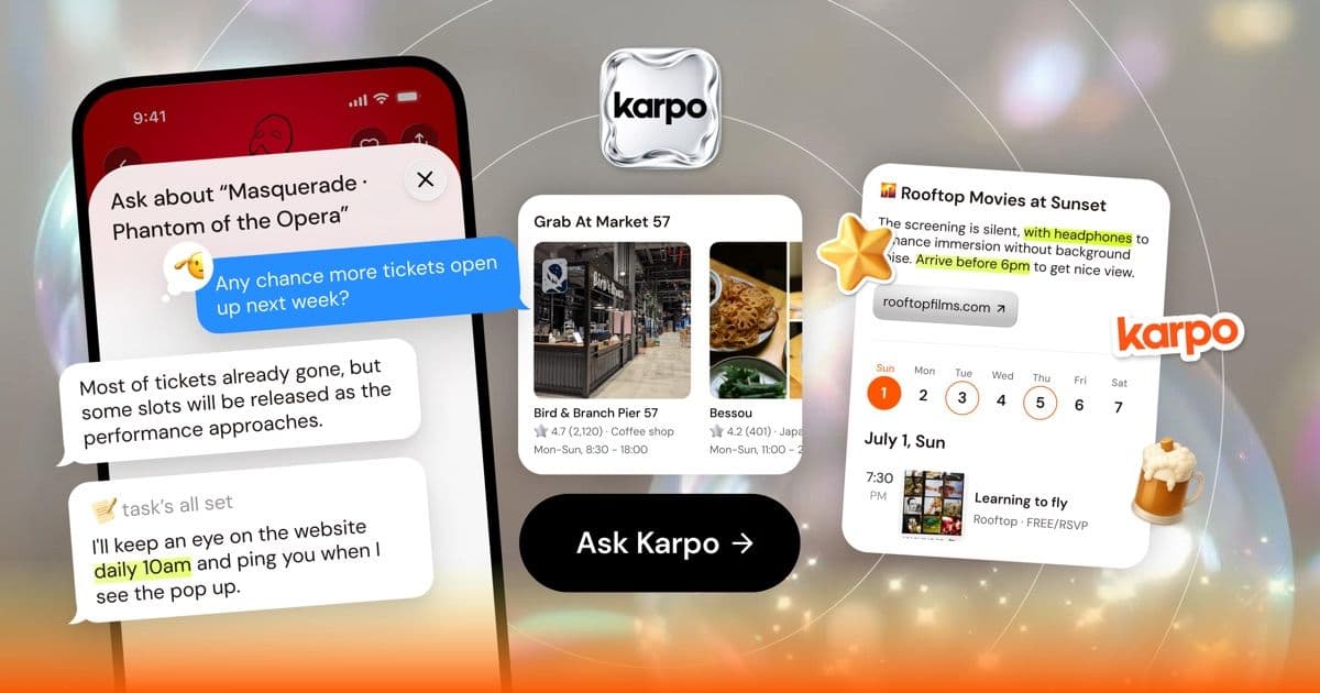
About this app
Karpo is an AI-powered going-out companion that turns vague moods into concrete plans across your city. Instead of scrolling endless lists, you text Karpo like a friend with impeccable taste and get curated suggestions for nights out, low-key afternoons, or spontaneous adventures, from jazz clubs and cozy cafes to haunted bar crawls and photo-ready neighborhoods. Powered by city editors and real-time signals, Karpo surfaces plans that feel personal. It remembers what you like, learns from every choice, and starts anticipating your next move. When your evening opens up or a late-night set is about to sell out, Karpo pings you so you don't miss it. Karpo is free and available first in New York City, San Francisco, Miami and London.
Key features
- 1Chat-first interface that turns a mood or vibe into a concrete plan for the night.
- 2Proactive pings when a set is about to sell out or a price drops.
- 3City editor curation plus real-time signals across NYC, SF, Miami and London.
- 4Learns from every choice to anticipate the next plan before you ask.
Target customer profile
Drawn from the product itself, not from a survey.
Demographic
City dwellers
Pain points
Too many options and endless lists to scroll before going out
Primary needs
Curated places and plans that match their mood and schedule
Demographic
Newcomers to a city
Pain points
Not knowing the local scene or where to start
Primary needs
Hidden gems and a personal city playbook that learns their tastes
Demographic
People planning nights out and weekends
Pain points
Missing time-sensitive plans like openings, price drops and events that sell out
Primary needs
Alerts and ready-made plans for a night out with friends
Scout Review
Written by AI from measured evidence, scored out of 100.
Karpo is an AI going-out companion that turns a mood into a plan via chat, live in NYC, SF, Miami and London. The product idea is sharp and the site has real personality — a bold display headline and a chat mockup that instantly communicate the concept. Execution is uneven: the hero buries its best asset below a blurred water video, the CTA gets lost, and the only explanation of the flow is tiny text in a phone frame. Speed is strong (89 mobile Lighthouse, 1.1s LCP) and accessibility is excellent (100/100 automated). Security is competent but unremarkable — 8/13 headers, no CSP, no DMARC, no published audits. Growth is the open question: a real problem and a real wedge, against three free incumbents with vastly more place data.
Measure by measure
Usability
54Nav is clear and the chat mockup hints at the flow, but the only explanation of how it works is tiny text in a phone frame, and the main CTA gets lost under stickers.
Design
58Bold extended all-caps headline and a coherent chat/venue-card mockup give real personality, but the first viewport is just blurred water and the stickers feel unintegrated.
Speed
72Mobile Lighthouse 89/100 with 1.1s LCP and zero layout shift is genuinely quick; desktop drops to 77, likely dragged by the full-bleed background video.
Security
63HTTPS with HSTS, frame protection and referrer policy in place, but no CSP, no Permissions-Policy, no DMARC, and no published compliance or audit page.
Accessibility
80Lighthouse a11y audit scores a clean 100/100, with only one failing audit around accessible names on labeled elements; no WCAG statement or multi-language support evidenced.
Growth
58Real problem (decision fatigue before going out), specific wedge (chat-first mood matching plus proactive sell-out pings), but Yelp, Maps and Time Out are free and enormous.
Improvement areas
- Hero buries the headline and CTA below a blurred water video; first viewport lacks orientation.
- Phone mockup text is too small to read, weakening the only explanation of the product flow.
- Security headers incomplete: no CSP, no Permissions-Policy, no DMARC; no published audit or security page.
- No WCAG statement, keyboard-navigation notes or multi-language support despite four-city footprint.
Design & Usability
Karpo's homepage has a real voice: the extended all-caps headline and the chat-with-venue-card mockup communicate 'conversational city guide' faster than most landing pages manage. The problem is placement. The first viewport is a blurred water video and a nav bar — no headline, no CTA, no product — so the strongest asset is buried below the fold. The supporting copy is low-contrast over the video, the phone mockup text is too small to scan, and the pop-art stickers read as decoration rather than system. Usability-wise the nav is clean and the four links plus 'Get the APP' are easy to parse, but the primary 'Ask Karpo' CTA is visually understated and competes with the stickers. Onboarding clarity is the weak link: the only explanation of how the product works is a tiny phone frame.
Speed & Security
Speed is a genuine strength. Lighthouse mobile scores 89/100 with a 1.1s LCP, zero cumulative layout shift and 350ms total blocking time — snappy for a page that leads with a looping background video. Desktop lands at 77, which suggests the video is the main budget hog; swapping to a poster image with lazy video would likely close the gap. Security is competent but not exceptional: HTTPS is enforced with HSTS, frame protection, X-Content-Type-Options and Referrer-Policy are all present, but there is no Content-Security-Policy, no Permissions-Policy and no DMARC record. The 8/13 header checklist is mid-pack. No SOC 2, ISO, pen-test summary or bug-bounty page appears in the site content, which is normal for an early-stage consumer app but leaves third-party assurance unverified.
Accessibility & Growth
Accessibility is the standout measured result: Lighthouse's axe-core audit returns 100/100, with a single failing check around elements whose visible text labels don't match their accessible names. That's a fixable detail, not a systemic problem. What's missing is the softer evidence — no WCAG statement, no keyboard-navigation notes, no multi-language support mentioned despite operating in four cities. Growth is the harder call. The problem Karpo names is real: decision fatigue before a night out is a genuine, recurring pain. The wedge — chat-first mood matching plus proactive pings when a set is about to sell out or a price drops — is specific and is the one thing Yelp, Google Maps and Time Out structurally can't copy quickly. But those three are free, enormous, and already own the place-data layer Karpo depends on. Four cities is a sensible beachhead; the question is whether the conversational layer is enough to pull users off the default apps.
Conclusion
Karpo is worth a look if you live in one of its four cities and you're tired of scrolling Yelp for twenty minutes before every night out. The chat-first flow and the proactive sell-out pings are the parts that feel genuinely different, and the site's voice suggests the team knows its audience. What it needs next is clarity: put the headline and CTA above the fold, make the phone mockup legible, and publish something — a security page, an a11y statement, a changelog — that lets a skeptical visitor verify the claims. The bones are good. The packaging just needs to stop hiding them.
Suggestions for improvement
- Move the headline and 'Ask Karpo' CTA above the fold; the water video is costing you first-impression clarity.
- Enlarge the phone-mockup text or replace it with a short animated demo so the flow is legible at a glance.
- Add a Content-Security-Policy, Permissions-Policy and DMARC record to close the header checklist gaps.
- Publish a short security/a11y page and a changelog so visitors can verify claims without taking them on faith.
Alternatives comparison
Named competitors, point by point. Nobody paid to appear here or to be left out.
 Karpo |  Yelp |  Google Maps | Time Out | |
|---|---|---|---|---|
| How you discover places | Chat with an AI that translates a mood into a curated plan | Search and browse crowdsourced reviews and star ratings | Map-based search with reviews, photos and directions | Editorial guides and ranked lists by city |
| Personalization | Learns from every choice and anticipates the next plan | Basic history-based recommendations | Location and history-based suggestions | Minimal; editorial rather than personalized |
| Proactive alerts (sell-outs, price drops) | Pings when a set is about to sell out or a price drops | No proactive event alerts | No proactive event alerts | Newsletter and editorial alerts only |
| City coverage | NYC, San Francisco, Miami and London | Global, thousands of cities | Global, essentially everywhere | Dozens of major cities worldwide |
| Price | Free | Free (ad-supported) | Free | Free (ad-supported) |
Yelp
Crowdsourced reviews and recommendations for local businesses.
Google Maps
Mapping service with place recommendations and reviews.
Time Out
Editorial guides to city events, dining, and culture.
Comparing options? See Karpo alternatives, scored side by side
More Lifestyle & Entertainment apps
View all Lifestyle & Entertainment
Factory Direct Mattress Overland Park
92A locally-owned mattress store in Overland Park, KS offer...

RoomCreator
92An AI-powered interior and exterior design tool that tran...

SheetScroll
90> You play; SheetScroll turns the page. It listens through the microphone or a MIDI piano and holds the page until it's sure where you are.

Hireci
89Save every recipe. Plan every meal.

TUNL - Cave Flyer
89A hold-to-thrust cave flyer with a new daily level, ghost races, and a global leaderboard.

Portrait Gift
88AI-powered personalized face swap art platform creating c...

TranscriptYou
88Free YouTube transcript generator with timestamps and AI ...

Roami eSIM
88A global travel eSIM app offering instant activation, no ...

FaceSwapAI
87AI face swap for photos, videos, GIFs with free trial.

youtubetomp3.ink
87Free online YouTube to MP3 converter with no signup or so...

InviteVia
87InviteVia is a digital invitation platform for creating beautiful online invitations for weddings, birthdays, engagements, parties, and special events. Choose a template, customize your invitation, collect RSVPs, and share it instantly through WhatsApp, Instagram, SMS, or a simple link. No guest accounts or app downloads required.

Coloring Pages Pro
87A massive collection of free printable coloring pages for...


A platform dedicated to providing unbiased reviews of newly launched applications, analyzing everything from their features to their full potential.
info@scoutforge.net© 2026 Scoutforge. All rights reserved.
